


The Mortgage Reports
Launched in 2004 as a loan officer's blog geared towards personal business growth, The Mortgage Reports (TMR) evolved into a nationally recognized outlet for in-depth coverage of mortgage and real estate news
While the content of the site evolved with times, the UI remained outdated - a basic Wordpress “freebie” template with no clear identity for the site.
Overview
Project Goal
The primary goal was to enhance the user experience of The Mortgage Reports by:
simplifying the UX flow of the calculators
Update the look and feel of the site with accessibility as the top priority
Improve conversion rate
My contributions
As the only UX designer at the company, my role was highly collaborative with the product owner and the dev team. I lead the redesign efforts by conducting domain research, competitive analysis, establishing design systems, and ultimately crafting an intuitive and effective website for users.
Note: It is important to highlight that this project wasn't a typical one-time research-design-handoff endeavor. Given the dynamic nature of the site, page elements underwent continuous testing and refinement based on results. The site and its design were in a constant state of evolution, with the addition of successful elements requiring thoughtful rework of prior designs. This case study zeroes in on my unique design approach and problem-solving methodology in navigating this ever-changing landscape with focus on the mortgage calculator.
The problem
TMR site has a lot of mortgage calculators (FHA, VA, USDA, etc). The mortgage calculator however, is the most visited by the users. Data indicates that users have the highest drop off in the form funnel if they come from this page. The requirements are to improve the UX flow of the calculators, and decrease the form drop off rates.

The solution
After conducting an extensive design audit and observing user behavior through Hotjar recordings, the calculator page underwent significant enhancements.
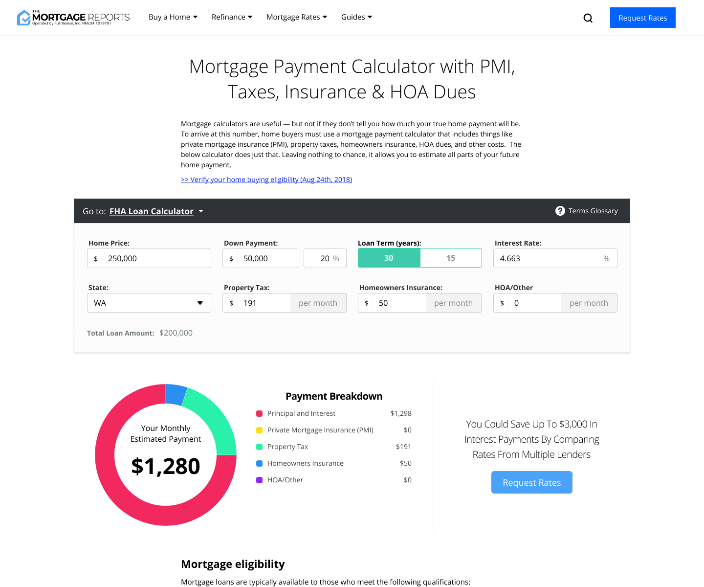
These improvements encompassed mobile responsiveness and a revamped color scheme that adheres to AA contrast standards, thereby enhancing accessibility.
Users behavior suggested they found the interface simple and intuitive. The strategic separation of the lead generation funnel and guiding users to it post-calculations resulted in a notable 20% increase in form conversion rates.
Design process
Research
Tasked with tackling the UX of calculator pages I discovered portions of the site had already been redesigned, and parts of it already in production. This redesign that was underway had been worked on by three previous contractors without a design system in place nor any comprehensive UX audit of the site, user research, or competitor analysis.
This meant that I had to readjust my strategy for the calculator page. To address this gap, I adopted a two-pronged approach:
Phase 1
Fill the existing UX design gap. I began by understanding the audience and their needs by gathering insights into the target audience, their preferences, and specific needs. To accomplish this, I used Google Analytics data, and Hotjar recordings. Additionally my initial plan included a thorough review of all prior user studies, however I discovered non existed, and the lack of budget for UX research forced my decisions to rely heavily on assumptions and insights gathered from the competitor market landscape followed by A/B testing of proposed solutions.
Interviewing stakeholder helped. It provided more context regarding the site, and allowed me to clarify point on what is legally required to meet compliance, as well as understand the persona we were trying to target.
Key Activities:
User Persona Analysis: Studied existing user personas to gain insights into user demographics, behaviors, and goals.
Review of Previous User Studies: Examined any available user studies and feedback to understand pain points and user preferences.
Stakeholder Interviews: Conducted interviews with key stakeholders to gather additional context and insights.

I conducted a comprehensive UX audit of TMR pages, providing clear recommendations for improving language and user flows to enhance overall user experience.

After completing the site audit, I initiated the process of creating a design system. The absence of a cohesive design system had manifested in inconsistent heading fonts and button sizes. To address this, I focused on standardizing fundamental elements such as fonts, colors, form fields, and reusable components. Additionally, I revised the color palette to meet WCAG AA contrast standards, considering factors like color blindness. I also expanded the color guide to include recommended pairings.
The primary goal was to establish common set of components to facilitate efficient design planning, streamline development processes, and ensure a uniform user experience. Recognizing the original site's lack of mobile-friendliness, the design system placed a strong emphasis on responsive design principles.
To facilitate consistent implementation across the development team, detailed documentation and guidelines were created.
This guide also served as a reference point for outsourced designers and developers, ensuring that everyone involved in the project adhered to the established design principles.
Phase 2
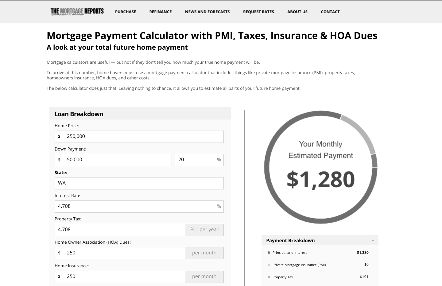
In the second phase of the project, I embarked on the actual redesign of the calculator pages. To gain valuable insights into user behavior, I started by closely observing Hotjar videos. The analysis revealed a notable issue where users were frequently confusing the Call-to-Action (CTA) button with the "Calculate" button. Additionally, the highly stylized font design used in displaying results posed challenges for users, affecting readability. The extended vertical input layout of the calculator proved cumbersome for mobile users, requiring them to scroll multiple screen lengths to view results or make adjustments to input numbers. This often resulted in user frustration and, in some cases, abandonment of the page.

The calculator and the form funnel blend into each other often taking users away from their primary goal and into a questionnaire that asked about their private information. The simplified amortization graph also lacked context to what was being shown.

The stylized fonts made it difficult to see the graph in mobile, often the text would bleed outside the viewable area.
Comparative/Competitive Analysis
To further inform the redesign process, I conducted a thorough evaluation of the existing calculators used by the top competitors of themortgagereports.com. This comparative analysis aimed to identify both commendable and deficient aspects across the market. By scrutinizing a variety of calculators, I distilled best user practices and observed innovative offerings. This comprehensive approach allowed me to gather valuable insights into the diverse landscape of mortgage calculators, providing a nuanced understanding of user expectations and preferences. Leveraging these findings, I sought to incorporate the most effective design elements and functionalities into my redesign, ensuring that the new calculator pages would stand out as user-friendly and competitive within the market.


I analyzed competitors' calculators to understand what worked and what didn't. This involved identifying strengths and weaknesses in the market, distilling best practices, and noting innovative features. This approach helped me gather insights into user expectations, guiding my redesign to be both user-friendly and competitive.
Ideate
I translated my insights into action by creating rough wireframes for the redesigned calculator pages. Due to budget constraints, traditional user testing was not feasible at this stage. Instead, we decided to rely on Hotjar recordings to capture user behavior on the new design. This decision allowed us to move swiftly into developing final high-fidelity designs, considering both market research insights and intuitive design decisions. The culmination of these factors ensured a comprehensive approach to crafting a user-friendly and competitive redesign, with real-time adjustments for an optimal user experience informed by user interactions through Hotjar.


The iterative process allowed us to experiment with numerous concepts until we honed in on the one depicted in the bottom right. This approach facilitated creative exploration, continuous feedback, and refinement based on user needs.
Deliver
I translated my insights into action by creating rough wireframes for the redesigned calculator pages. Due to budget constraints, traditional user testing was not feasible at this stage. Instead, we decided to rely on Hotjar recordings to capture user behavior on the new design. This decision allowed us to move swiftly into developing final high-fidelity designs, considering both market research insights and intuitive design decisions. The culmination of these factors ensured a comprehensive approach to crafting a user-friendly and competitive redesign, with real-time adjustments for an optimal user experience informed by user interactions through Hotjar.
Final Results
Following a comprehensive redesign initiative, The Mortgage Reports witnessed substantial improvements across all critical metrics. The implementation of the new design system, meticulously crafted to meet a minimum of AA contrast standards of WCAG, significantly enhanced the site's accessibility. This not only ensured readability for all users, including those with visual impairments but also reflected a commitment to inclusive design principles.
The overhaul of the calculator pages, driven by user-centered design thinking, resulted in a decluttered and intuitive interface. Users reported a smoother and more enjoyable browsing experience, leading to a noteworthy 20% increase in form conversion rates. The restructuring of menu options and adding more clear language simplified user journeys, catering to the needs of both the typical home buyer and homeowner.
Embracing a mobile-first design approach proved pivotal as the site became responsive, adapting seamlessly to various devices. This shift not only addressed the evolving user behavior favoring mobile platforms but also reflected an SEO minded forward-looking strategy that positioned The Mortgage Reports as a dynamic and accessible resource.
Fully componentized website for quick mockups, development, and testing.


