


Xbox Portfolio Tracker
The Xbox Studios Portfolio Tracker started as a kanban board, shifted to Microsoft Word and Excel documents, and later evolved into a web portal with a Microsoft Excel-like frontend and CRM backend. Despite these changes, the tool had high abandonment rate, and serious limitations to what it can do. This prompted a need for a complete redesign from the ground up.
Parts of the project are under NDA agreement, and I am unable to show full design iterations
Overview
Project Goal
The goal of the project was to redesign the Xbox Studios Portfolio Tracker, transitioning from a limited, complex web portal to a user-friendly, feature-rich tool. The primary goal was to enhance user experience by addressing pain points and providing a more efficient way to track and manage data related to releases all the while taking accessibility into consideration.
My contributions
As the only UX designer on the team, my role was to lead the redesign efforts by conducting user interviews, domain research, and competitive analysis. I played a key part in defining personas, establishing design principles, and ultimately crafting an intuitive and effective tool. My responsibilities included ideation, prototyping, usability testing, and iterating based on user feedback.
The problem
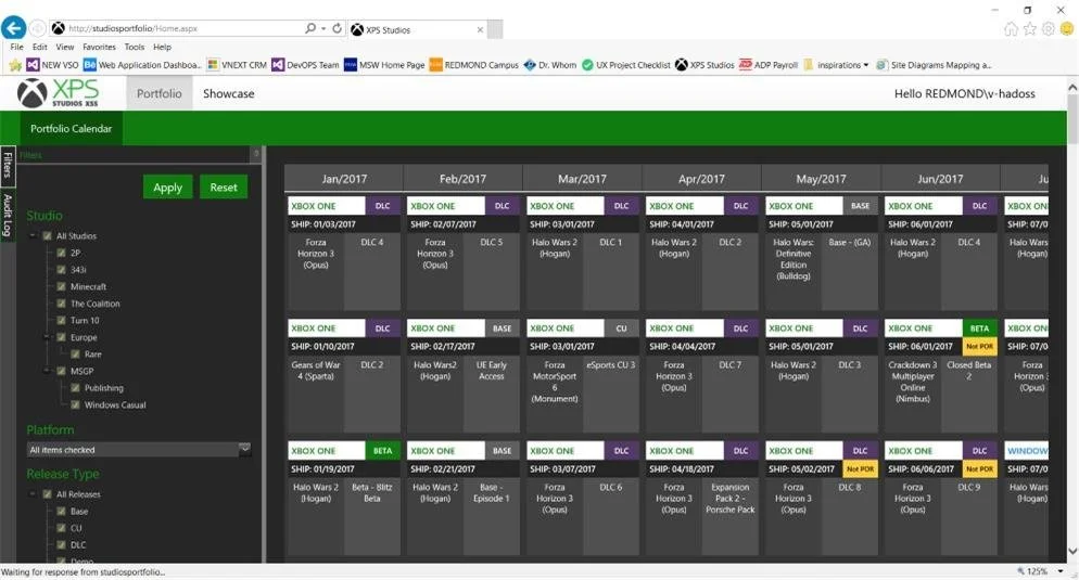
The existing Xbox Studios Portfolio Tracker (XSPT) suffered from outdated technology and a cumbersome data entry process. Users faced challenges with cluttered UI, lack of contextual information, and difficulty in navigating the system.
Updating data, particularly in CRM Dynamics, was a universal pain point, leading to a backlog of obsolete information. Decision fatigue and memory fatigue were prevalent issues, hindering user productivity. The tool lacked a cohesive and efficient way for users to understand and contribute to the release schedule.
The solution
The solution involved a complete redesign of the web tool, keeping user needs at the forefront. The new design aimed for simplicity, flexibility, and intelligence. Key features included a revamped Release Calendar, Dashboards, Database, Statistics, History, and a robust Search feature.
Simplicity, flexibility, and accessibility guided the development of this tool. The interface provided users with essential information upfront and the ability to delve deeper when needed. Onboarding and help sections were incorporated to enhance the user experience.

Design process
User Interviews and Personas
I aimed to adopt a more user-centric approach for this project, moving beyond the generic "interface is hard to use" perspective. To achieve this, my user interviews focused on understanding user needs, daily tasks, and pain points. I deliberately avoided framing questions around the tool's shortcomings to prevent bias and sought to uncover pain points organically.
Patterns emerged during the user research, highlighting the need for distinct personas. The system revealed three types of users:
Contributors, who serve as custodians of the data
Consumers, who use the data in presentations and future planning,
Guest, The ocassional visitor who looks at the data to plan for media events and such.
This discovery led to the intentional creation of three personas to better address the diverse user needs.

Significant short comings emerged from the interviews emphasizing data entry challenges, data point hierarchy within releases, and the overall cumbersomeness of the tool itself. Users often found themselves editing entries that were old, and often duplicated.


Top Left: CRM data was listed without any hierarchy resulting in hundreds of data entry, some of them repeating.
Top Right: White boarding exercises allowed me to see how each data point connected and helped organize the security structure of the users and their access to specific section.
Left: Data from CRM was cleaned up and organized into a hierarchy structure.
Comparative/Competitive Analysis
Competitive analysis was focused on tools in the market that partially met the criteria since a direct match did not exist. Inspiration was drawn from Google Calendar for release scheduling, Trello for data release cards, and Jira for release planning. This approach allowed for a nuanced understanding of potential solutions.


Ideate
Affinity diagramming merged insights from user interviews, domain research, and personal experience to identify key patterns. The emergence of memory fatigue, lack of context, and navigation issues led to the creation of two personas representing contributors and consumers of information, guiding subsequent design decisions.


Due to time constraints, wireframing was not feasible, prompting a shift to high-fidelity design exploration once the process flow and user stories for each section were defined. This decision had the advantage of expediting design handoffs to developers, enabling a quicker transition from conceptualization to the development phase.
The urgency of the project meant that there was only room for one round of prototyping and usability testing before moving to production. The initial design was well received however, feedback indicated a the white background would tend to wash out during presentations on projector.
Deliver
A second round of iteration was initiated. with the ability for users to switch between light and dark modes. This feature significantly improved the usability of the product during presentations, and also, allowed the users to set the defaults based on their computer settings and preferences.

In response to user feedback, the release tool was redesigned to have a light and dark mode.
Final Result
The positive reception of the new clean design paved the way for the consistent application of these principles throughout the entire tool development. The resulting app boasts simplicity and is organized into key components, including the release schedule, title attributes, production schedule, and accessibility dashboard. Each section offers a broad overview of information, encouraging users to delve deeper into the data.
Data analysis indicates nearly zero latency in data updates, and users are engaging with the site more frequently compared to the initial iteration.


